UX Design | Visual Design | About | Contact | Resume
*The UX Case Study for Showcation is currently under construction *
IN THE MEANTIME PLEASE FIND DETAILS ON THE GRAPHIC DESIGN AND BRANDING OF SHOWCATION BELOW
Graphic Design for Showcation
Creative direction and branding for first-year summer camp themed music and arts festival, Showcation.
Overview
Project Type
Branding guideline creation, digital assets for social media, physical assets
Duration
February - May 2024
Team Members
I was the only designer on the team, and I worked closely with a 3 person marketing team.
The Problems
Showcation is a music and arts festival that just completed a successful first year. The main challenge was beginning to work with Showcation after they had already made some design decisions. For example, some brand colors, the logo, and the website were already created before I began, and a few assets for social media had already been posted. The difficulty with this was that the work had been done ad-hoc by different team members, without an intentional creative/brand direction. The website and social media assets did not look cohesive, and the logo was difficult to read and use in certain scenarios. There were also issues with the typography and colors being used.
The Solution
I created a brand style guide to guide creative decisions, tweaked and expanded the color palette, selected new fonts with a focus on readability, and adjusted the logo to reflect these changes.
In addition, I designed assets for social media, a lineup poster, a 3-day schedule, the site map, artist announcement templates, FAQ templates, wristbands, signage, bandanas, and branded emails. Overall, I created a more cohesive, professional brand to lend credibility to a first-year event.
Process
Work on Showcation began in 2023, so I was not involved in initial design choices such as color, logo, and typography. I started by familiarizing myself with the existing branding choices while beginning to design assets that needed to be posted on social media as soon as possible, like artist announcement templates. Because assets were needed as soon as possible, it meant I did not have time to work solely on the brand style guide before beginning asset design. It would have been ideal to have solidified the creative direction before beginning asset design, but the project pace did not allow for that.
It is important to note that it was requested that all design changes made did not alter the existing design of things so significantly that the website would not look the same to returning users. I kept this in mind with the design changes I implemented.
Before designing each asset (poster, map, schedule), I researched how other festivals designed the assets to gather inspiration and to understand commonalities.
Initial Showcation Brand
Below are some examples of the Showcation branding when I began in February 2024. The brand style consisted of:
Rainbow colors using the website builder preset colors applied to H1 headers, although this was not applied consistently to H1s across all pages
Using the fonts Tonight for headers and Stampa for body copy, except for certain blocks of the website that allowed the selection of one of 6 preset fonts to be used instead
AI-generated images (lack of real photos/images to use due to this being a first-year event)
Animated page breaks and borders around some photos
Primarily using beige, black, and red colors and sometimes blue on the website
Instagram assets did not appear to use the same color palette as the website for assets already made
Beyond this, Showcation had not narrowed in on the identity of the brand beyond wanting to be unique and playful, have summer camp vibes, and be an event that is about more than just the music.
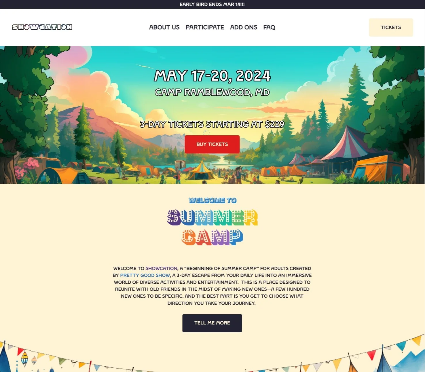
Showcation website homepage

Showcation website Ticket Booking page

Showcation website Add-Ons page

All Showcation Instagram account posts as of the time I started
Color
I began iterating on the Showcation brand by evaluating the colors in use. Below are the initial colors that Showcation was using.
INITIAL COLORS
#DD1E1B
#1B79DD
#FEF4D5
#232233
I changed the red and blue colors in use to be more harmonious with each other and less bright. The red was quite harsh, and based on user feedback, indicative of negative actions (ie. hang up, cancel). I tinted the initial red color to soften it, and to steer away from the association with taking a negative action.
I changed the initial blue to be more complimentary to the red in use, less harsh, and similar to colors already used in the first artist announcement posted on Instagram. These subtle changes created more harmony within the primary colors already in use. Since the red and blue were predominantly used for buttons and as accent colors on the website, the slight changes to these colors would not be so obvious to a returning website user, which aligned with the request to keep things recognizable.
NEW COLORS
#E44B49
#009AAD
#FEF4D5
#232233
I designated the blue, beige and black colors the primary colors for the brand. The beige and black are to be used primarily for font and background colors. The blue is the main accent color used for font, button, callout, and occasional background colors.
PRIMARY COLORS
#009AAD
#FEF4D5
#232233
I designated the red color a secondary color, and I expanded the color palette to include additional secondary and tertiary colors.
SECONDARY COLORS
#E48333
#00AD6B
#CE1970
#5E0C77
#E44B49
#E9D166
TERTIARY COLORS
The primary and secondary colors form the backbone of the showcation branding. These colors, along with tints and shades of them, are the main colors used in the logo, icons, and graphics. The tertiary colors are not used, except when more than the main 4 colors are needed (ie: blue, red, yellow, and purple have been used, including gradient options of those colors, and you need an additional colorway or option).
The website was already using rainbow colors for the H1 headers on most pages, however the colors were stock colors from the website builder. Using tints of the primary and secondary brand colors, I created a gradient rainbow to be used within the logo. This evoked the playful, childhood nod to a rainbow while being intentional and branded. The pre-existing use of rainbow colors also influenced the secondary and tertiary color palettes.

H1 rainbow effect before branding

H1 rainbow effect after branding
Typography
Initial Fonts Used
After tweaking and expanding the color palette, I began to assess the fonts in use across the website and social platforms. The initial fonts in use were Stampa and Tonight.

The issues with these fonts were two-fold: they were only available in all-caps, and they were not part of a font family that included different weights and styles. The all-caps nature made reading the website challenging, as it reduced readability. In addition, the website body copy was almost completely center-justified when I started, reducing readability.
Limitations
In selecting new typography for Showcation, I needed to keep in mind specific limitations concerning the website builder in use. I was limited to selecting 2 fonts, as the website builder allowed a maximum of 2 custom font uploads. The website builder did not allow for font families to be uploaded, so I had to be very selective of what was used on the website. Although the full font families could not be utilized on the website, choosing robust families was essential for other asset designs.
The New Typefaces
I changed the typefaces to Bungee and Montserrat. Bungee had a similar feel to Tonight - akin to retro, marquee letters - but with a cleaner, more modern feel. In addition, the readability of the Bungee typeface is better than Tonight. Montserrat was selected because it has a robust font family and pairs well with Bungee.

Overall, these changes had important results:
Increased readability
Flexibility for design because the font families are robust
Ability to create visual hierarchy
I also pushed for the website body copy to be center-aligned as much as possible to further increase readability. I think the changes made a big difference for ease of reading and increasing the overall professionalism of the website.

Typography before

Typography after
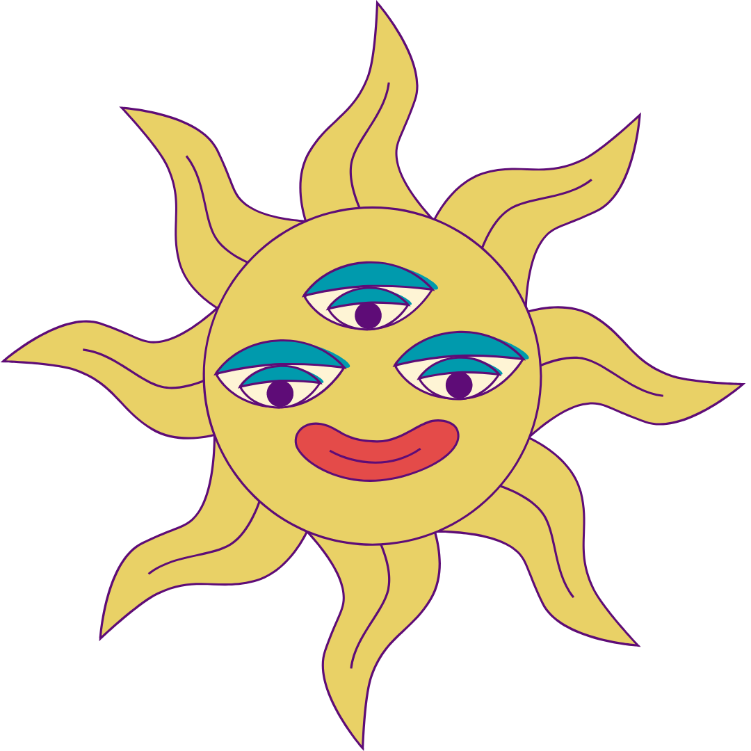
Icons
Some icons had already been used in asset creation when I joined the team. As the goal was not to completely reinvent the branding that had already been used, I decided to take a closer look at the icons. Luckily, there were a few others by the same designer that would fit the visual tone that the brand wanted to communicate (playful, reminiscent of childhood and summer camp). Vera Smirnova (aka @lopolitt) was the designer of the icons, and I implemented the same style (particularly the outline stroke) in designing additional icons for Showcation.
Icon Color Palette
Most icons followed the below color palette. The odd icon (ie. the tree) needed to use colors from the tertiary color palette to create sufficient contrast and cohesion in the assets it was used.
#E44B49
#009AAD
#FEF4D5
#F5BCBB
#E9D166
#5E0C77
Vera’s Icons in Showcation Colors


Additional Icons I Designed or Redesigned following Vera’s Style


Logo
Initial Logo
When I started, the logo used the font Dovde Thin. It is a very thin, outline font, and the only other font in the family was a fully filled-in version, Dovde Black. This thin font made the logo difficult to read, especially because the logo also had rainbow colors applied to each letter and a border effect to try and make the thin font bolder. It was challenging to make out the logo on non-solid backgrounds, particularly when the font size was small.
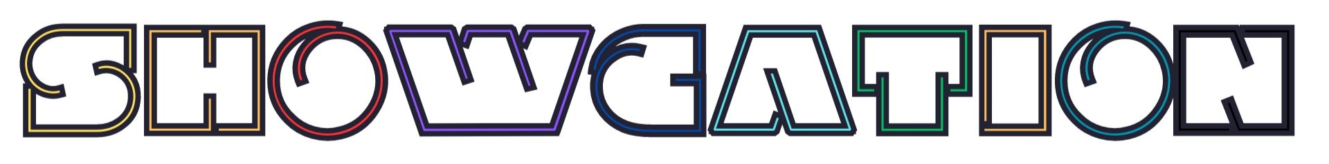
New Logo
While designing the lineup poster for the festival, I used Bungee Shade for the event name - Showcation - and we liked it so much that we decided to move forward using Bungee Shade as the logo font for all future assets. Bungee Shade was more legible than Dovde Thin, the rainbowing of each letter was actually visible due to the blockier nature of the letters, and the ability to put Bungee behind Bungee Shade allowed us to maintain legibility on non-solid backgrounds like texture, photos, and video.
One of the tasks going forward for Showcation will be to evaluate the on-the-fly design decisions that were made in the past 4 months
Outcome & Results
A branding guide was created, and changes were implemented across both the website and social media assets (video and graphic designs). Due to the nature of the tight deadlines, it was challenging to ensure that other team members implemented the branding guidelines when creating assets. There were a few moments where the old logo and fonts were continued to be used. This impacted brand cohesion a bit, and was a good lesson on the importance of having a quick meeting to talk through the changes instead of assuming people will read about them.
It would have been ideal to have had more time before assets needed to be created to think through the overall design direction for the brand. Trying to flesh out the brand and make changes while designing things was not ideal - changes to the brand were made after some assets were posted.
Assets
I designed a lineup poster, 3-day schedule, the site map, artist announcement templates, FAQ templates, wristbands, signage, bandanas, templated emails, merch, and more. The gallery shows a few of these designed pieces.

Showcation lineup poster
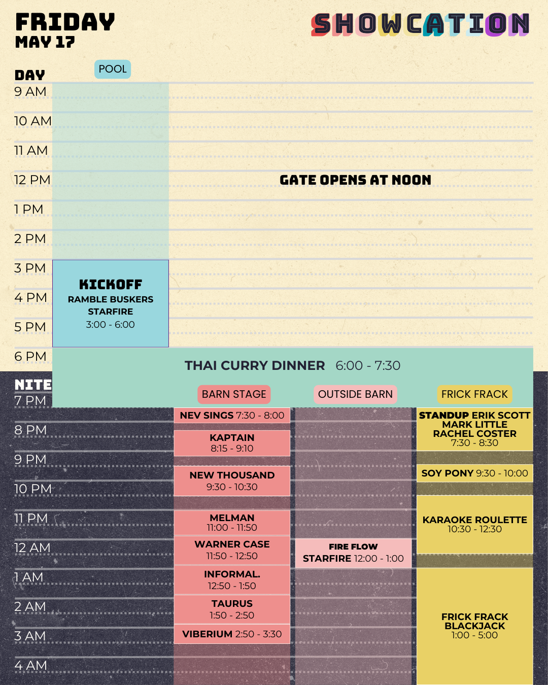
Showcation Friday Schedule

Showcation Saturday Schedule
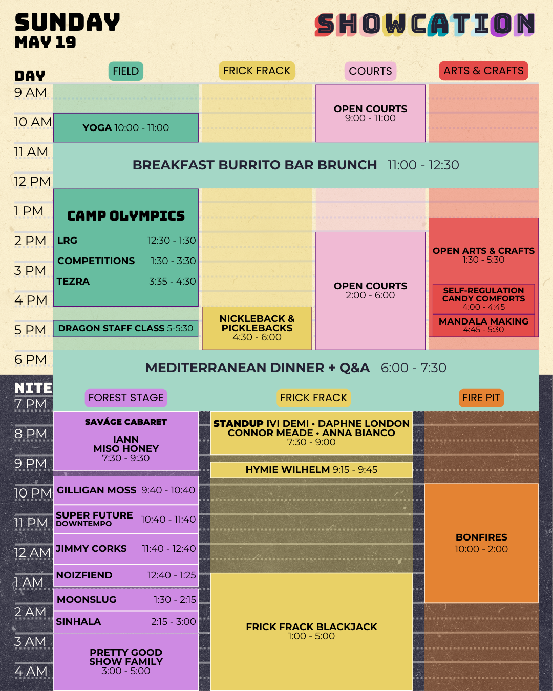
Showcation Sunday Schedule
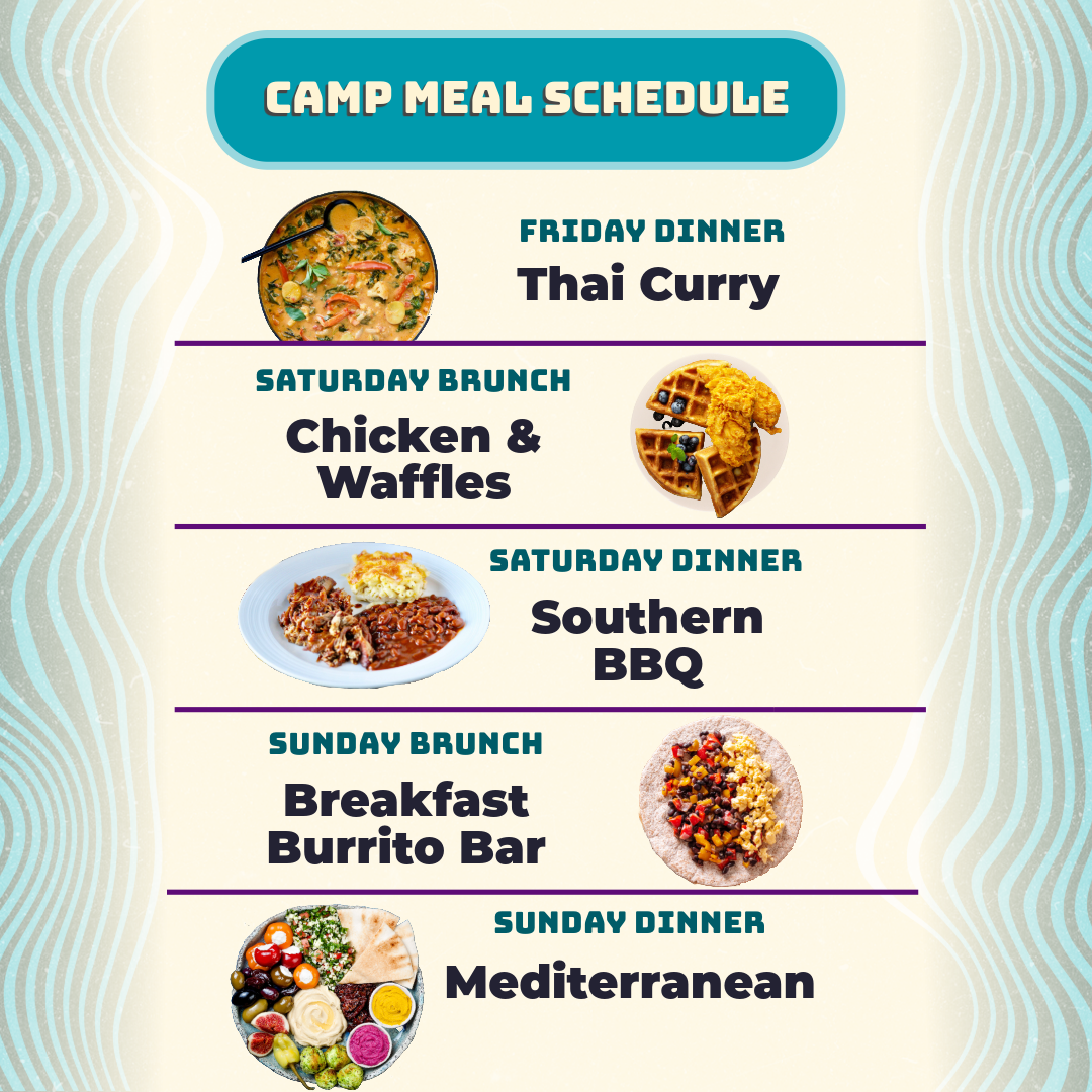
Showcation meal plan schedule for Instagram (1:1 size)

Showcation ticket giveaway post for Instagram (portrait size)
Showcation Facebook page banner

Showcation bandana with map on it
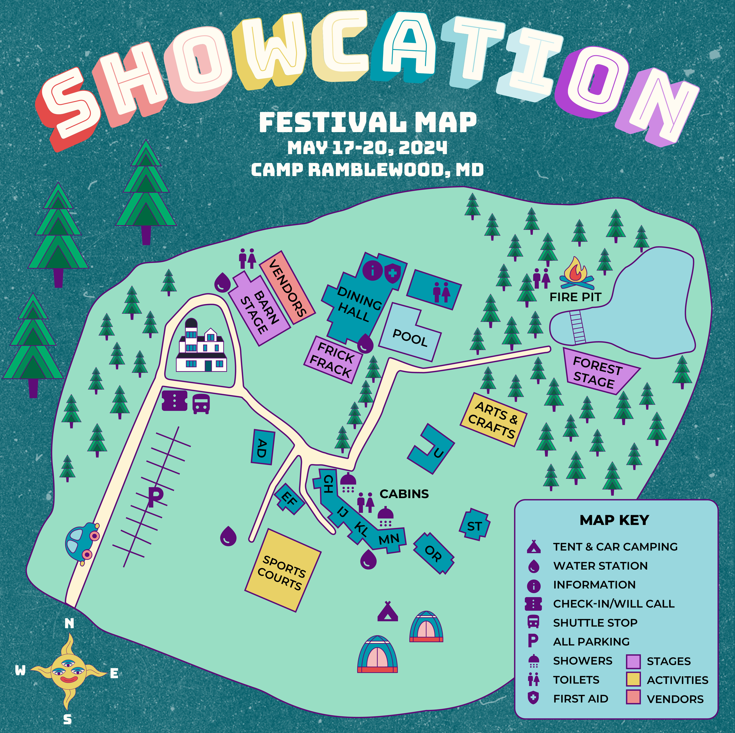
Showcation festival grounds map

Weather forecast for Instagram (1:1 size)